Friday, November 21, 2014

Self Evaluation for BA1

First of all, I do feel this project could have gone a whole lot better, but I would've expected to struggle to adapt to the increased workload so quickly. Needless to say I know what to expect for the next project so that I can approach it with less hesitation next time.

For strong points, I felt I was particularly good at discovering ideas and developing them. Ideas such as the dogs being part of the 'untouchable society' and thus got all their gold from thieving and begging, or the whole Tinderbox plot being a trick set up by the possessed princess in order to free herself from captivity. I would not have come up with these ideas had I not done the research and attended the group crit sessions, of which I made sure to attend every single one so that I could get consistent feedback on my work. I also felt I was particularly strong when understanding the silhouette stage of work, where I quickly understood that the silhouettes needed to be quick, undefined work rather than 10+ minute jobs, meaning I could get many of them out much quicker than others did.

However, I felt I let myself down a little on the iteration stage. After being in one of the lectures and being shown the sheer scale of iteration work in the games industry, I know that the amount that I have done does not even compare and there were a lot more elements that I could have considered for my character, such as alternate colour schemes, patterns on various parts of the clothes as well as accessories. I could have also done with more 
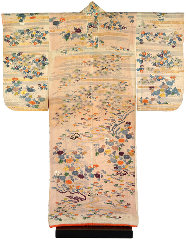
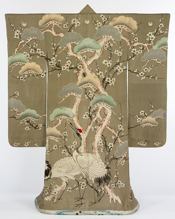
iterations on the parts I did iterate on – I only produced 3 different designs for the kimono and, although I do like the design from the one I chose, I felt there could have been a whole lot more potential there that I missed by pinning down on a design too early.

What could I do better for next time? Create a more formalised work structure so that I know I will produce the right amount of work for my projects. The beginning of the project should be about doing research and formalising ideas, which should only take a few days at most along with having the silhouettes done. Then I should devote the main bulk of my time to doing iterations and making sure that I do them a lot quicker than what I was doing before. Although I did do paint-overs, I took too much time on them, so I should work to practice making my work more efficient and learning how to express more with less work.

Overall, considering it was my first project, it didn’t fail as much as I had been expecting. Though I do know I could’ve produced a lot more work had I known the scale of work that was to be expected out of us, I am now aware of what is needed from me in the next project.


Thursday, November 20, 2014

Final Outcomes for BA1


Final Character Piece - The Princess

Looking back to the character sheet, I felt inspired by the pose of her sitting as well as from way back where I started with the original pose of her with her hand raised. It took a while otherwise to find a pose that I liked, but that also suited her personality. Composition wise, I feel like it is quite balanced as the character is not overpowered by anything in the background - I wanted to make sure that she is the focus and thus left possibly distracting objects out. Though, I do feel that the place she is positioned in could be better aligned. I would otherwise leave this piece untouched as I think it is a well-rendered representation of what I think she would look like.


This is the first final environment piece, which incorporates the character standing on the ledge and looking out over the snowy city. I'd first considered having the city look grey and blue, but I soon realised how to create an effect which would make the city look like a group of snowy roofs spanning over the landscape. This made my process a lot more efficient than painting each one manually, and I feel like I am getting better at expressing a lot within fewer brushstrokes. As for improvement, I felt a little more tone could have been added as I feel like the colours are quite scattered, few and far between, making the composition quite sporadic in places.


In the final environment piece I decided to take one of the initial thumbnails and adapt it into the current environment. This meant thinning out the trees and covering a lot of the landscape in snow. I wanted this environment to be in the sun so that the shadows would be a lot more vibrant but, in all honesty, this piece felt a little rushed and if I had the time I would go back and work on it more. This one I would work on the most as I feel like the trees on the right especially break the flow of focus, which is not what I am looking for in these pieces.


Life Drawing 2

Finally we were able to get a session in for drawing from a nude model. It was rather difficult to get used to considering this was my first time drawing from the nude, but I eventually got into the flow, though I do see that I need a lot more practice.


This was the first piece I did from life and, to be blunt, it isn't very flattering. I struggled at getting the angles of the legs right, so eventually I left them off. The torso is probably the least bad area of the whole thing but I felt I could have done a whole lot better here. Though, for my first time it was a lot better than expected, but I know I have a lot of room to improve.


We then moved on to quick sketches, at 5 minutes (Row 1), then 3 minutes(Row 2). At first, I struggled to make sure that everything fit in the small space that I was working in, meaning that in some images, the top of the head was cut off or the bottom of the legs were omitted. Despite this, I felt like I was getting the hang of drawing quick and getting the overall gesture down before the time ran out.


The next two are done at 2 minutes per piece (Row 1) and 1 minute per piece (Row 2). As the time grew shorter I ended up miscalculating on the first piece, which meant I often ended up with at least one unfinished piece. This gave me a feel for the next three, however, and I eventually ended up getting far enough that I could draw the basic gesture of the human body in just one minute. Though I do know I need to practice more, this is good progress and I feel a lot more confident now than I did before.


We were then given the rest of the session to draw an accurate representation of what we had in front of us. The tutor showed us measures to make sure the angle on certain body parts was correct, which was using your pencil to lay across the edge of the body and transfer it to the paper. He also advised us on using the head and body parts to measure into other body parts to make sure that it was proportionate. I was surprised that this had never occurred to me before, but I was going to make sure to use it in every life drawing afterwards. Considering it was my first time using these techniques I was a little shaky, but I think it helped make my work more accurate in the end.


We also had another life drawing session today, but this time we were drawing costumed characters. This time the model was lying down on the ground so I had a lot of foreshortening to contend with, but I made sure to do a lot of measuring out so that the proportions would look correct. I am seriously impressed at the quality of work that I came out with, and I did not expect to get the foreshortening down so easily. Though there was another model to draw, I only had enough time to focus on one but I think it really paid off, as I am actually happy with this piece.


Sunday, November 16, 2014

Environment Development 2

Considering the earlier feedback that I was given, I decided to start over and re-evaluate what I was doing. Since I had designed my character to be wearing a winter kimono, I needed to create my environments to suit which, considering the weather in Japan, meant having plenty of snow and ice.


I created an adaptation of the first environment that I did, since I liked the idea but the composition was off. I removed the mountain on the right and instead made it hilly, and I changed the angle of the building in the foreground. I already had ideas in my head about what I was going to do for this piece.


This piece was a little harder to complete in terms of perspective since the horizon line is not visible at all here. It was difficult especially to get the boards on the roof to be evenly spaced. I wasn't entirely sure on the composition of this piece but I went in and developed further to see if my suspicions were true.


I was really beginning to appreciate how this piece was coming out and was genuinely excited to start working on it fully. I added a little bit of haze in the background to simulate how low visibility would look like while it was snowing. I also applied very bleak, dull colours to capture the essence of the depths of winter.


I was still unsure about this piece but it felt a lot more complete than it did before. In this piece, the sky would be clear instead of cloudy so that a lot more sunlight would be passing through and entering the room, creating quite a dramatic lighting.


The thick snow of the outside environment really captivated me, so I decided that I would develop this into one of my final environments. For the interior, however, I felt that it simply would not work for me and instead decided to develop another piece from earlier development.


Saturday, November 15, 2014

Environment Development 1

Now that I had finished most, if not all of my character work, I had to focus on environments. This would not be too difficult for me considering I already understood perspective. It was more about capturing the style of Edo Japan buildings that I had to be concerned about.


I started by drawing out four different scenes, some of them considering how to put a character in, as one of the final environments must include the character somewhere. At this point, I liked the concept of the first, second and third the most.


Going on to introduce value, I felt that the first thumbnail did not look as well as it could have. I was still happy with number 2 and began to like number 4, whereas I thought that number 3 was a bit boring composition-wise considering most of it was face-on.


I did a few more of the fourth image from different angles as it was suggested to me in a group crit session to consider doing it at eye level. I still felt that the original image had a lot of good composition, and I also thought that the fourth image here had a lot of interesting composition.


So I went forth and picked the four images I thought would look most interesting in colour. I picked a very mute yellow-green and violet to paint under the existing line-work. It was an interesting start but I felt like it needed more.


I tried painting over this time and it was at this point that I realised that I had erred somewhat. In the group crit someone pointed out that I had primarily been focusing on winter so far and I noticed that I had completely forgotten about it. I also felt like, looking at these pieces more closely, that there was not as much in the way of composition than I had originally thought, so I considered a different direction instead.


Friday, November 14, 2014

Composition Analysis

During the most recent lecture, we learnt vital rules of composition in good pieces of artwork. The five main rules included the Divine Proportions, Rule of Thirds, "L", Cross and Iconic rules.

Divine proportions are named so because of how often they appear throughout nature. Da Vinci's Human Figure in a Circle is a prime example of this, but it can be seen almost anywhere in living beings. It is also related to the Fibonacci sequence and the golden spiral.

The Rule of Thirds is relatively simple, and is something I have previously encountered within studying of Photography. It is more utilised in cinematic shots or landscapes. Items or focal points that lie across the lines that cross over the one-third points either vertically or horizontally create a better balance of composition. There are also additional elements where additional lines are taken across diagonally through the whole image and then to the opposite side, touching the closest third corner to create a lop-sided triangle. Many iconic pieces follow these guidelines, which is why a lot of them are so effective.

The 'L' is like a frame within a frame. Imagine shrinking down an image to fit into four of the six thirds, or more, or less. It balances composition by making sure everything doesn't stretch too far into each other.

The Cross is a rule which encompasses two imaginary lines. The lines cross through the middle and are often in a horizontal/vertical arrangement. One line is the 'leading line' and generally is where most of the focus is placed. the other line is the 'stopper' line and is where elements of the image change, be it colour warmth or whether it is dark-on-light or light-on-dark. However, this technique is hard to utilise properly.

Iconic is quite similar in shape to the Cross, but is more like the Rule of Thirds in application. Iconic is based off of lines which pass through the middle both horizontally, vertically and diagonally to each corner, as well as from each centre-side to the top and bottom side respectively. Placing high-contrast points to change across these lines creates effective composition.

Now I have detailed the fundamental composition elements, I am going to look at some pieces and analyze their composition.


Image 1 - Sky by elleneth

It is clear that the most prominent composition used is the rule of thirds. The large spire lies exactly along the right third, with the plains skirting across the lower third. The 'eye' of the spire is almost on the upper-right focal point. However, there is also some elements of the 'L', here, considering the angular, almost 90 degree incline that the spire takes compared to the plain.


Image 2 - Blind Reaper by Algido

This image has utilised the Rule of Thirds to its maximum potential here, applying subtle consideration of both the focal points created by the thirds (the chest of the right soldier lies exactly on a focal point) and the diagonal lines. There are also elements of the 'Iconic' rule, such as the blood spurts and momentum of the soldiers following the diagonals toward the centre.

Who Let the Dog Out? by jasonwang7

Image 3 - Who Let the Dog Out? by jasonwang7

Again, the Rule of Thirds is aptly applied. The dwarf in the foreground, whilst not exactly on the focal line, touches upon it. The dog collar is also similarly placed towards the bottom-right focal point, with a diagonal line that leads from the top left to bottom right leads exactly over the collar and footprint, guiding the eye almost perfectly through the sequence of events.

Industrial cityscape1 by moonworker1


Image 4 -  Industrial cityscape1 by moonworker1

There is a lot of application of both the rule of thirds and the iconic rule here. The road in the foreground leads perfectly across the bottom-left/top-right diagonal line, which guides the eye onto the opposite duagonal line, following the rule of thirds before being directed into the iconic view, being guided across the cityscape by the diagonal curve of the city across the top.

Image 5 - Denialism by Tatchit

Whilst the Rule of Thirds is again applied here - the hands lie directly on a focal point - the most notable thing, to me, is the use of the Cross. The bottom half is dominated by warm, bright colours whilst across the middle - over the stopper - it switches to dark and cold colours. The wing on the left side is also well placed, following the diagonals created with the Rule of Thirds perfectly - not directly on the line but close enough to see it is there.


Thursday, November 6, 2014

Development and Iteration 3

I knew I was getting close to the design I wanted, though in hindsight I should have probably put a lot more effort into the iteration stage. This was the final stages, however, and I needed to move on to producing the model and character sheet relatively soon.


I started to produce a more refined picture of my character to get more of a feel for her. I struggled with the fabric even though I used a lot of references and eventually I moved on as I knew I would spend too much time on it otherwise, when I could have been focusing on something more important.


I also did a few more final iterations, such as for her hair comb. Although, I wasn't terribly concerned about the detail on the hair comb as if I were to visualise the final model, it would not be very visible on the character herself compared to more important parts, such as the pattern on her kimono. Either way, I did not want to leave it completely plain.


I then began work on the model sheet. I bounced for a while on the consideration of how I would draw her model, but eventually I settled on the idea of using flat colours and line-art to create her form, as painting her in would take too long considering the overall complexity of her kimono design. However, the line-art itself was very tedious, even though it helped to define the pattern on the kimono clearly. I made sure as well to define the vital parts of where her body lines up, at the top of her hair, bottom of the head, shoulders, where the arms appear out of the sleeves, bottom of the hands, bottom of the kimono and the bottom of her shoes.


I also created a separate model sheet to show the detail of the hair comb. I drew it from all orthographic angles so that the modeler would have a clear idea of what it looks like on all sides.


I then began work on the character sheet. At this point I wasn't terribly good with poses so I used references to try and get the walk style correct. However, when I showed these to the group crit session the overall consensus was that the walk style was too wide for her clothing. I wasn't overly happy with this character sheet so I scrapped it and started over.


Eventually I ended up with this. I considered more about the clothing that she was wearing and what poses she may end up doing throughout the course of the game. I wanted to capture an aloof character who, whilst looking formal, has a quirky side. I also wanted to capture her foxy nature through the small faces on the full body poses on the left. The poses go as follow from the left along the row, then onto the next row - walking, bowing, sitting, sitting and laughing, holding something, looking concernedly away, and angry. The faces on the right are just a few of the expressions she would make, going from normal, to shocked, to laughing and then angry. Since her hair is shaped to look similar to a fox's ears, I wanted to create the appearance of hackles raising when she is angry. 

Next is the environment and final character pieces, which will probably take a lot of time considering the amount of detail that should be put into them.

Monday, November 3, 2014

Kitsune of Japanese Folklore


Kitsune appeared in Japanese folklore in roughly the 7th century. Unlike their Chinese counterparts, they grew wildly popular within the people and quickly grew to be a staple of their folklore, even making it into part of their religion. (1)

As a mystical entity, most Kitsune are envisioned as foxes. After 100 years, a Kitsune can gain a human form and are able to shapeshift between fox and human. A Kitsune is even able to take on the form of another human, though their preference is often for young or beautiful women or older men. Each Kitsune has an array of tails, arraying from one, five, seven and nine and rarely other numbers. The 9-tailed foxes are the most powerful and are often golden in colour. A Kitsune has a main tail, which is the source of all its power. A person would have to chop off all the tails to kill a Kitsune, since it is impossible to tell which one is the main tail.

There are two primary classifications of Kitsune. The zenko are believed to be associated with the God of Fertility, Inari. They are generally benevolent compared to their more malevolent counterparts, the yako, or Nogitsune. There are also variants, such as those who are only apparent through the possession of a person, or classifications based on their element.

Each Kitsune has an object which is extremely precious to them, because it allows others to control them. These Star balls contain their life force, and are often percieved as white-gold orbs. The Kitsune would protect their Star balls ferociously and reign hell down on anyone who took them. They also despise being trapped and forced into situations they do not want, often doing their best to get out of it, even if it involves killing. Aside from that, they will often trick people just for the fun of it, hiding their prized objects and fooling them. (2)

There are ways to tell if someone is possessed by a fox spirit. Often, they would have insomnia, cold and clammy hands and lack of appetite. The individual in question may also seem to be strangely friendly towards a particular fox, such as setting out food for it. There are believed to be whole families who may be possessed by foxes, who have to remain outside of society for fear of their mischievous companions (3). Possession by fox spirits may also have been an explanation for mental illness long before medical practices improved. Women are more often possessed than men, which are targets for their tricks instead. In some stories, there may be other telling signs of Kitsune. Most of them have trouble hiding their multiple tails when in a human form. They may also have other fox-like features upon their person, such as fine coatings of fur. There may even be other ways, such as through their shadow or by seeing their true form in a reflection. A possessed individual would have to be exorcised, which would either involve going to an Inari Shrine, attempting to do it yourself or, in extreme cases, getting it beat out of you. (4)


Bibliography:
(1) http://academia.issendai.com/fox-japanese.shtml
(2, 4) http://www.mythicalcreaturesguide.com/page/Kitsune?t=anon
(3) http://www.koryu.com/library/dlowry12.html

Development & Iterations 2

After looking back over my current work, I thought that I needed to re-approach it from a different angle. In one of the group crit sessions I was informed that I was using too soft of a brush and that it was making it too defined when it didn't need to be. Considering this, I created my own brush which is based off of a square. It rotates depending on the direction that the brush is going and has a small amount of opacity and size change depending on the pressure of the brush. This is the result of trying it out.

 Even though it is a lot less defined than the last one, it feels a lot more seamless. Here I decided to see what it would be like if the character was in summer wear rather than winter wear. In summer, the outer kimono wouldn't be worn, showing the obi in full. Some women may have also had a fan as an adornment, which didn't make sense in my earlier painting since she was in winter wear. Instead, for the winter wear, she would be holding a thick piece of fabric which was designed to keep her hands warm. However, in the end, I didn't want to include this because I wanted to show the kimono design in full, as this is an integral part to the character.


During the group crit, it was also suggested to me to look at how Game of Thrones incorporates their character design into their clothes. This got me to thinking about folklore and, although I initially did not want to touch upon it, the ever-popular Kitsune. After a period of research (Will be shown in the next post) I decided to incorporate this and change the character a little.

Instead of the Queen, I decided to go with the Princess instead. I chose to do the Princess because, in the story, she is locked away by the King and Queen due to the saying that has been going around about the common soldier who is destined to marry the Princess. The Princess is actually a fox spirit who has possessed the Princess, who was found out by a priestess (The Witch). The priestess spread the rumor to keep the Kitsune trapped whilst she can find a way to exorcise her and return the Princess to normal. In folklore, Kitsune hate being trapped, so she devises a trick to fool the priestess, which involves the Tinderbox.

In folklore, Kitsune have these objects called Star Balls which are vitally important to them. The Princess convinces the priestess that the Tinderbox is her Star Ball in disguise, but she would need a person with an impure heart to get it else the 'dogs' will kill her. The priestess asks a passing Ronin to get the Tinderbox for her, but she is unaware that his own curiosity would be her undoing. The Ronin proceeds to abuse the power of the Tinderbox and eventually manages to free the Princess, thanks to the rumor that kept her trapped in the first place. As a reward, the Kitsune agrees to marry him.

As for the Kimono design, I wanted to incorporate the design of multiple fox tails, but in disguise as the character is in disguise. The leaf fronds you see are actually the tails, cleverly disguised to look like plants rather than foxtails. This also matches up with the fact that, in folklore, most Kitsune have telling features to those with sharp eyes. I also did a variant on the hairstyle, which is a mix of the two rightmost hairstyles on the previous iterations post. The hair, instead of rounding out, peaks like the tips of a fox's ears. It would be an interesting idea to incorporate these into the emotions of the characters, much like how a fox uses its ears to display emotion.

Saturday, November 1, 2014

Life Drawing 1

Every other week we've been taken out to do life drawing. It's unfortunate, however, that our group has been missing the sessions inside where we would draw from a nude model, as I would really like to brush up my human drawing skills. Nevertheless, this is what I've produced so far.


 This piece was actually done at the beginning of the course. We went out and drew Norwich Cathedral. Although I was already familiar with the concepts of perspective, it still took a while to get the form exactly right, especially making sure that the proportion of the building is correct. I also wasn't aware of making sure to map out your drawing area so I ended up going off the page to the right and the top.


Another perspective drawing, and this time it is in the town, just above the market. Again, perspective was little to no problem for me, but this time I focused on making sure that everything was in proportion to each other. It was not an easy feat but I managed it better than I did before, I believe.


We were then taken the next fortnight to Norwich Castle, where they have a section with a lot of taxidermy animals. We were asked to combine multiple creatures into one that, whilst not real, would make sense anatomically. This was a lot more difficult than initially thought, but I started out by looking at goat heads, trying to get a feel for how they are ideally proportioned and how the horns fit on the head.


I then took a look at the lions, trying to capture the sense of movement that the taxidermy created by using loose, flowing lines. I feel like I captured the movement pretty well, and by this point I began to formulate an idea on what I wanted to combine together.

This was the result. I combined an antelope head, a lion's body, and a pelican's wings. I'd initially started a different sketch but I was informed that the balance of the body was off so I restarted into this. I did not have much time to finish so it was left in a very sketchy state when I had to present. The tutor thought that the seamlessness of the form was good, especially on the wings. However, he also had to point out that I could have spent more time on it to get a more finished result. I agree, though it was a lot more difficult than I originally thought to get a shape pinned down which I thought would suit the creature.

Tuesday, October 21, 2014

Development & Iterations 1

Continuing from my silhouettes and initial development, as well as utilising my research into clothing in the Edo period, I began to develop a more refined character; The Queen of the story.

At the moment, it is still very rough. I only created the rough outlines of her clothes so that I know what everything is and where it should go. Creating the patterns for the clothes is a crucial step that I need to do a lot of consideration into, as I will have to keep in mind the ideal colours and detail for someone of her status. I may have to use existing designs as a reference to make sure that it looks proper for someone of high status in Edo Japan.

For now, I focused on creating various designs for her hair. Hair varied a lot from a single basis, which usually involved the hair being slicked back with wax and pinned with a comb. Some styles would incorporate a shaved in widow's peak, and are often accessorised with hair sticks and ribbons. Out of these current designs (with the first one not being an actual design, but the 'base') I prefer the rightmost, as it is not terribly extravagant but captures the essence of a very eloquent and cultured woman of power.

This is just the start, I still have to do a lot more development to create a finalised design that I am happy with.

Lighting Analysis 1

As part of our studies into lighting and how it is crucial towards creating a realistic image, we were asked to analyze a group of images of our own choosing, stating what worked well within each image using the knowledge we learnt in the lecture.


Image 1 - Temple in the Jungle by lepyoshka

It is readily apparent in this image that the light source is coming down from above, possibly through a gap in the trees. We can tell also because a lot of the water is reflecting the blue light of sky as well as green from the foliage. However, this light is also being bounced elsewhere throughout the rest of the image, although the varying angles of the thick foliage mean that a lot of this bounced light is scattered, making the rest of the environment dark and gloomy. The scattering also seems to be caused by a mist, as suggested by the far background.


Image 2 - Achtorjah Mountain by FerdinandLadera

It is not easy to see at first where the light source lies within this image. However, deducing from the saturated lights and dark shadows created on the left side of the mountains, there appears to be a gap in the clouds through which intense sunlight is shining down on the mountainside. Or, perhaps, the light source is coming from the far back, through the gap in the mountains on the right side of the image. One can see distantly that a similar situation is happening where the front side of the mountain is being hit by the light, leaving the rest in shadow. However, due to the diffused light of the mist, this is not as easy to determine compared to the foreground. There are examples of some bounced light, most notably within the valley in the centre of the image, as the side of the rock is still visible even though - after determining the light source - it should be in shadow.

Concepting a medieval street by Gycinn

Image 3 - Concepting a medieval street by Gycinn

There is plenty of bounced light within this image. Even though there is a light source shining in from the right and the top of the image, a lot of the image is not directly influenced by the light, instead gaining shape from bounced light off of the various buildings. However, the bounced light can only reach so far, as various areas are left in deeper shadow, such as the shop door and the wall as it gets closer to the foreground. There are a few examples of the atmosphere itself reflecting directly off of some parts of the image, which is demonstrated by the blue tinges on the wood structure of the building on the right side of the foreground.


Image 4 - Winter Village by andreasrocha

There is no direct source of light in this image. All of the light is diffused, having to pass through the thick layer of clouds before it can reflect off of the houses below. This creates very soft, desaturated light which is very dim to the viewer. However, because of the way the clouds are lit up I would determine that this image is set in the early morning, just after sunrise. This is due to the intense shadows that are still there in places. These shadows are predominately facing toward the viewer, which is shown by the tower in the foreground on the right, where one side of the roof is less in value compared to the side which is facing towards the background and thus towards the sun's diffused light.

Resistance 3 - Mines Pt 2 by dee-virus

Image 5 - Resistance 3 Mines Pt 2 by dee-virus

In this image there are some prominent light sources, scattered throughout all of the image as lamps. It can also be determined that there is another lamp down below the floorboards of this level, as shown by the intense lights that leak through the floor and the hole. It is possible that the light source on the far right is from the sky and not the flame of the lights because it is much colder in colour, in contrast to the warm light that comes from the lamps. These lights create a myriad of shadows due to the beams in the mine blocking their light, being much darker and more intense due to the relative closeness and intensity of the light sources. There may also be some instances of bounced light towards the left side of the image as there are fewer light sources over there, yet it is still visible to the eye.

Fjord by SebastianWagner

Image 6 - Fjord by SebastianWagner

The light source in this image is the sun, coming down from above but slightly to the left of the centre of the image. This is determined due to how the rocks are lit - the left side is in the light whilst the right side is casting a shadow across the water. Although this light source is not very intense because of the lack of intensity to the shadows. Due to the low angle that this image is viewed at, the Frenel effect is visible from the rocks being reflected off the water's surface. However, this reflected light is very diffuse and it is impossible to see the rocks in the water aside from their rough shape.

Saturday, October 18, 2014

Silhouette Summary & Development Part 2

After producing a first set of silhouettes, I still felt I could produce more, so I experimented with different brushes. One of the best ones I found created a very erratic and spiky effect when moving the pen quickly, whilst being small when I was slow and consistent with my brushstrokes. This created a good variety of parts that stuck out, which I could turn into various accessories later on.

I saw a lot more potential in the silhouettes developed here. I kept in mind the basic shape of the kimono which is very prevalent throughout Japanese clothing. I also began to form a basis of what character I wanted to create. Whilst originally I wanted to either do the soldier or the witch from The Tinderbox, after doing my first silhouettes I felt more drawn to the Princess or the Queen, as this would allow me to bring in quite extravagant designs as the royalty often wore quite bright and detailed clothing to denote their status. Here are three silhouettes that I developed so far from this silhouette sheet. 
The first design I feel could represent the soldier, however I was not terribly drawn to this idea compared to the next two. The second could represent the King or Queen, since I did not give the design a defining gender and I could transform it into either. Judging from the pose, I feel that the second design would be more male, though. The third design is possibly my favourite out of the three, although I know it needs more development after my research into fashion designs in the Edo Period. I may just select this one to develop from here on as I feel like the pose is very expressive for the Queen, who I felt to be quite aloof and very confident in herself.


Silhouette Summary & Development Part 1

Since being given the theme of Edo Japan for my first project, we were set to produce silhouettes towards our first character design. The basis is from the short story The Tinderbox, within which we are supposed to apply our themes. From the first character design tutorial I was given the impression that silhouettes we create should be quite formless, using only subtle suggestions to show the form and pose of the person and to have little to no design to it so as to not form pre-conceptions.

So, I began, using a large brush set at a fairly low opacity. It was mostly like scribbling, but trying to stick to very loose guidelines such as maintaining a fairly human-looking shape. These silhouettes were the result of the first go-around.


At first, I used a very low opacity, but I experimented in increasing opacity and using a smaller brush size for creating silhouettes. The only problem with creating very fast and formless silhouettes is that there were a lot that I did not see much in, so a lot of these figures were not developed at all and only a few were selected. The following were selected and developed further, as shown below.


I developed more of a form with these figures, but I did not add any defining features or personality as I could very much change my mind upon seeing other figures. I only chose one to detail further, yet I still kept detail to a minimum until I researched into clothing designs. I still do not think that I am not finished with this stage as I feel there is still more that I could explore and experiment with in terms of silhouettes and early design.


Kimono Design in Edo Period

As stated previously, kimono design evolved due to craftsmen adapting to the strict rules that the shogunate had put in place to keep social classes in their place. Subdued designs often became the norm as some colours such as red were forbidden for lower classes, as well as certain fabrics. Higher classes, including royalty would still proudly wear forbidden colours such as red, but craftsmen creatively applied them, such as along linings and underneath, which were not restricted by the laws. Here are some images that would represent kimono designs of the time.