Friday, May 8, 2015

Creative Iterations 1

Given the ease of working with primitives in Maya, I decided to do the bulk, if not all, of my iteration work in 3D. I decided that, based off of my investigations into Georgian follies, the most defining features of my folly should be a circular design, surrounded by pillars.


 My first iteration was relatively simple and small in design. However, it felt too simplistic and that I could do more, so I changed it up a little.

I then developed it a little, trying to capture the inner arches between the pillars by using the bridge polygon tool with multiple divisions, with a little bit of success. However, at this point I was unsure of how to fill it in after I created the bridges and I felt like it was stepping away from the modularity approach.


 I tried to think with modularity in mind by taking out half of the inner arches so that I could easily duplicate around the centre axis later.

I then added in a staircase so that people would be able to climb up to the centre of the folly, and also added in an inner area. By this point, I wasn't sure whether I wanted people to be able to go inside or to just have it as a solid piece of stone.


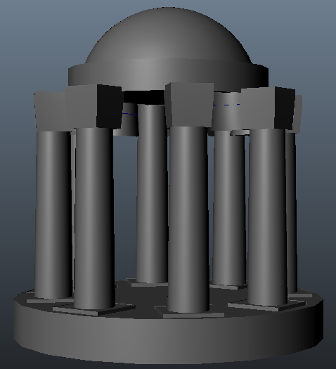
However, in the end, I changed the design to match more with this particular folly, as I liked the concept of the intricate design and delicate details within, which would draw people in for a closer look. Even so, it was far from finished as I also have to consider details. I was thinking that I would add some details up on the fake second level to let light trickle in from above, creating a dark and mysterious interior for those who would enter.


Wednesday, May 6, 2015

Mood Board - Georgian Follies


I went forth and collected some images of Georgian era Follies. At first glance there are many similarities that stand out to me - a lot of them are circular and feature some form of pillar structure around the main building. Perhaps it would be a good idea to consider a variation of this when creating my folly.

I also noticed that a lot of them share a similar kind of texture. As to what it is exactly, I am unsure. It seems like it would be stone but it would also be difficult to carve and haul such large shapes up to where they are ultimately located, so I am led to believe that it may be some form of plaster instead. Either way, it would be a good idea to investigate both these materials to get an idea of what to use in mine.

Tuesday, May 5, 2015

Creative Brief for BA3

We have finally been set our creative brief for BA3, where our development of modelling and architectural skills will be put to use to create an architectural piece based upon the research we have been engaged in over the past 4 weeks.

Our architectural piece will be a Folly. A Folly is defined as an architectural structure that is designed to serve as a conversational piece, or is created to lend interest to a particular view or commemorate people or events. They are usually quite small but can vary in size, shape and style, depending highly upon the location and surroundings.

During the next 3 weeks, we will be expected to design, mold and texture a folly using the architectural research we have been doing. In this case, my architectural research has primarily been on Georgian architecture, so this should be my focus for the creative brief.

We have been advised to consider the topology of our final model, as well as consider the following:


  • The modularity of the model. Build the parts of the model, if possible, then put it together. Think like Lego.
  • The scale of the model. If building in a modular form, is everything to the right scale? Make sure to do the grid.
I am a little unsure as to how to begin creating my folly. I think the best course of action to start is to collect images of existing Georgian follies and analyze them for similarities to get a starting point.

Friday, May 1, 2015

Final Submissions for 4 Model Studies

These 4 models were the final four I selected for submission for the study portion of this project, in order of when they were created.


I had created this initial decorative piece before the window,  but initially I wasn't happy with it. However, I went back and fixed it up a little and smoothed it out by adding a few bevels, but there were still some issues that would be difficult to fix without starting again, such as the odd geometry on the roofing.


The drainpipe was my second selection. Unfortunately, I didn't get time to go back and fix the issue with the ties, but nevertheless I thought it was one of the first studies that I was happy with in terms of getting roughly the right shape.


The memorial pillar was my third submission, with some changes from the last time it was shown. I tried to add a normal map and a simple ground to show how it sits at an angle, but to be honest, they could be a whole lot better done, as the texture for the stone does not look at all what it is meant to look like. The normal map could be toned back a whole lot, as right now there is too much texture for what the material should look like.


This was my final submission, and the one I was most happy with. I went back after looking at the critique I got and tweaked the geometry a little, as well as adding more texture and converting the bump map into a normal map. Whilst far from perfect, I am well on the way to creating realistic looking game-ready assets.

Wednesday, April 29, 2015

The Difference Between Bump and Normal Maps

 In cases where it would be inefficient to use geometry to capture minor details like the gaps between bricks or floorboards, another kind of texture map can be used which, for many years, was known as a bump map.


 This image shows three spheres. The first sphere has flat and has no texture assigned to it. The second sphere has a simple checker map assigned to the bump channel. The bump map tells the renderer how to light the model, without affecting the geometry. For many years, the bump map was used to create this extra detail, but often it seemed rather flat and unrealistic, especially if it was used heavily in a model. In succession, normal maps were created, which, by defining a lot more than a bump map, tells a lot more information to the renderer which helps it light the model in a more realistic manner. This is what is applied to the right-most sphere and, comparing the two method it is clear which is the most superior.


These are the textures that were assigned. Bump maps worked in greyscale, where how light or dark an area defined how 'displaced' an area was on the model. Normal maps work a lot differently. By simulating light hitting an object from three different directions, it is a lot more detailed, but also harder to replicate by hand.

 This is a visualisation of a normal map. This model is simply a cube with a torus laid on top. There are multiple lights that are rendered. First, there is a white ambient light. Then, in three directions, lights for the three primary colours are placed. Often blue faces straight down, with red and green being the other two. Finally, lights with the same colour but negative intensity are placed opposite of the directional lights.

However, this is often not how normal maps are generated. There are multiple ways that they can be made.

First of all is the most simple - converting a bump map into a normal map. This is not a perfect method but for most cases it works fine. Programs such as Crazybump and xNormal are able to do this.

The second method is creating both a high-poly and low-poly model and projecting the detail of the high-poly onto a normal map using the low-poly model's UV unwrap. You can do this with xNormal or even directly in the sculpting program zBrush, with a few tweaks.


Despite the versatility of normal maps, they must be used in moderation. When creating them, one must consider how much the detail will stand out and whether it is possible to get away with faking it without people notice. Sometimes it is flat-out better to use geometry as these maps do not change the geometry and all illusion is lost once you see it from an angle that isn't intended.

Monday, April 27, 2015

Life Drawing 4


This session we had another model, and our first task was to draw something like a character sheet, where we draw the person from four different general angles to get an idea of what they look like from each angle. Again, I had the issue of needing to warm up before I could begin drawing in a way that I was happy with, but beyond the first botched drawing I believe I did a fairly good job on matching the parts of her body up to keep each pose level with each other.

The second task this time was another long pose, and again I picked mid-tone paper. I am particularly happy with this due to the use of blending to create varied shadows and lights throughout the piece. For example, the shadow created by her arm as it lies across her stomach is a lot sharper than the shadow that is created as her thigh and stomach fade off into darkness. This, I feel, makes the lighting seem a whole lot more convincing and life-like.

5th Model Study

This, I decided, was to be my fifth and final model study, after which I would select the model studies I deemed most successful and submit them. This time I chose to do another window.

I picked this one primarily because of the difference in texture as well as an opportunity to use the knowledge I have learnt about the different texture maps. The most notable three I used here were the diffuse, specular and bump maps.


I got the general shape and texture of the window about right, but as was said to me in the group critique, it looks too straight and geometrical, so that is something I will have to fix later.


This is primarily showing off basic usage of the specular map. This shows the difference in specularity between the window and the bricks, which I managed to achieve by using a light area where the windows are on the specular map, with the bricks being a darker shade so they won't be as highlighted.


This shows off both the specular and bump map. Since, by this point, I wasn't quite aware of how to convert a bump map into a normal map, it still looks a little flat and odd, but much better than have it remain flat.


This is the geometry itself. I tried to keep it relatively low-poly and cleaned up as I went by using the merge vertex tool. However, there are some issues where there are a few long and thing polygons, which can prove to be an issue if I am not careful with how I use them.