Wednesday, April 29, 2015

The Difference Between Bump and Normal Maps

 In cases where it would be inefficient to use geometry to capture minor details like the gaps between bricks or floorboards, another kind of texture map can be used which, for many years, was known as a bump map.


 This image shows three spheres. The first sphere has flat and has no texture assigned to it. The second sphere has a simple checker map assigned to the bump channel. The bump map tells the renderer how to light the model, without affecting the geometry. For many years, the bump map was used to create this extra detail, but often it seemed rather flat and unrealistic, especially if it was used heavily in a model. In succession, normal maps were created, which, by defining a lot more than a bump map, tells a lot more information to the renderer which helps it light the model in a more realistic manner. This is what is applied to the right-most sphere and, comparing the two method it is clear which is the most superior.


These are the textures that were assigned. Bump maps worked in greyscale, where how light or dark an area defined how 'displaced' an area was on the model. Normal maps work a lot differently. By simulating light hitting an object from three different directions, it is a lot more detailed, but also harder to replicate by hand.

 This is a visualisation of a normal map. This model is simply a cube with a torus laid on top. There are multiple lights that are rendered. First, there is a white ambient light. Then, in three directions, lights for the three primary colours are placed. Often blue faces straight down, with red and green being the other two. Finally, lights with the same colour but negative intensity are placed opposite of the directional lights.

However, this is often not how normal maps are generated. There are multiple ways that they can be made.

First of all is the most simple - converting a bump map into a normal map. This is not a perfect method but for most cases it works fine. Programs such as Crazybump and xNormal are able to do this.

The second method is creating both a high-poly and low-poly model and projecting the detail of the high-poly onto a normal map using the low-poly model's UV unwrap. You can do this with xNormal or even directly in the sculpting program zBrush, with a few tweaks.


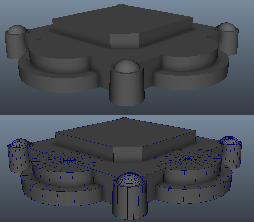
Despite the versatility of normal maps, they must be used in moderation. When creating them, one must consider how much the detail will stand out and whether it is possible to get away with faking it without people notice. Sometimes it is flat-out better to use geometry as these maps do not change the geometry and all illusion is lost once you see it from an angle that isn't intended.

Monday, April 27, 2015

Life Drawing 4


This session we had another model, and our first task was to draw something like a character sheet, where we draw the person from four different general angles to get an idea of what they look like from each angle. Again, I had the issue of needing to warm up before I could begin drawing in a way that I was happy with, but beyond the first botched drawing I believe I did a fairly good job on matching the parts of her body up to keep each pose level with each other.

The second task this time was another long pose, and again I picked mid-tone paper. I am particularly happy with this due to the use of blending to create varied shadows and lights throughout the piece. For example, the shadow created by her arm as it lies across her stomach is a lot sharper than the shadow that is created as her thigh and stomach fade off into darkness. This, I feel, makes the lighting seem a whole lot more convincing and life-like.

5th Model Study

This, I decided, was to be my fifth and final model study, after which I would select the model studies I deemed most successful and submit them. This time I chose to do another window.

I picked this one primarily because of the difference in texture as well as an opportunity to use the knowledge I have learnt about the different texture maps. The most notable three I used here were the diffuse, specular and bump maps.


I got the general shape and texture of the window about right, but as was said to me in the group critique, it looks too straight and geometrical, so that is something I will have to fix later.


This is primarily showing off basic usage of the specular map. This shows the difference in specularity between the window and the bricks, which I managed to achieve by using a light area where the windows are on the specular map, with the bricks being a darker shade so they won't be as highlighted.


This shows off both the specular and bump map. Since, by this point, I wasn't quite aware of how to convert a bump map into a normal map, it still looks a little flat and odd, but much better than have it remain flat.


This is the geometry itself. I tried to keep it relatively low-poly and cleaned up as I went by using the merge vertex tool. However, there are some issues where there are a few long and thing polygons, which can prove to be an issue if I am not careful with how I use them.

Saturday, April 25, 2015

Understanding Different Texture Maps


In order to create life-like models, multiple different types of textures must be considered. Here, I'll be talking about three different maps which can control how an engine renders your model.


As shown above, there are five spheres, all with different basic textures assigned to it. The first 'basic' sphere has no texture assigned to it, and has just a simple 'blinn' material attached. Blinn is a better choice than the program's default lambert because you have a lot more choice with assigning different texture maps.

The second sphere, the diffuse sphere, is a sphere with just a diffuse texture assigned to it. The diffuse defines the colours of the model and is probably the most important for basic models.

The third sphere has only a specular texture assigned. The specular controls the intensity and colour of the lighting that is placed upon a model. This is best used to create materials convincingly, such as metals. It is also very useful for models with different materials within it, where you can define how shiny different parts of a model are. For example, with a sword, the metal sword blade will be a lot shinier than the hilt, which means the specular texture will be brighter.

The fourth sphere has a gloss texture assigned. The gloss defines how rough part of a model is. This texture is only greyscale as colour in this texture does not make any difference to the rendering of the model. The roughness is defined as how large the specular highlight - the shiny area - is.

The last sphere shows how the specular and gloss work together. As the gloss is larger here, the specular highlight is very large in areas where the specular texture is also white. Using and experimenting with these methods can create a wide range of materials.


In Autodesk Maya, these three textures are under various names. The Diffuse is fairly self explanatory, located under 'Common Material Attributes'. By clicking the checkered square on the side of the diffuse slider you can select the choice to choose a file to load. 

The other two textures are located under 'Specular Shading'. The Specular map can be accessed by using 'Specular Color', whilst the Gloss map can be accessed by using 'Eccentricity'. 


Thursday, April 23, 2015

4th Model Study Update


I went back after my first post about this model and made some modifications based upon the critique I gave myself as well as what I received from other people. This involved shrinking down the brick part of the memorial pillar a little, as well as adjusting the lower plaque to better match the photo. However, the most work was done on the texture, adding in wear and tear as well as fixing the texture for the bricks. The wearing is mostly evident down at the bottom where feet will have scuffed the stonework and worn it away over time. However, there was a part up by the plaques where it was clear that some of the metal had eroded and run down the side of the pillar, which I tried to include in the texture.

Monday, April 20, 2015

4th Model Study

My fourth model study is going to be the Memorial Pillar located just beyond Castle Meadow Street in the Norwich city centre.


I thought that this would be a good choice because of the repeating elements, as well as the varied textures throughout the piece. If I build it up piece by piece I should be able to get it looking fairly accurate.


This is how it looks currently. I used a lot of the duplicate special tool to get parts such as the base and the small pillars to be similar to each other in geometry, as well as being well positioned so that I could easily join them up without having to move and line them up manually.

However, like before, there are issues I didn't notice as I was putting the model together. Some of the textures, such as just above the base, are wrong, as the solid stone should be bricks instead. I also need to add more erosion and tweak the geometry a little for it to be accurate.


Showing the geometry, I think I did a fairly good job on the topology. It means that, should I need to change anything, it won't be difficult to go in and tweak it, plus, it will be easier to render when placed in-engine.

Friday, April 17, 2015

3rd Model Study

My choice for the third model study was one of the pillars situated within the Royal Arcade, located right in the middle of Norwich.


The overall silhouette of the pillar is very simple to capture, the only issue I can see occurring is through the texture, as I am unsure as to how to create the shape of the intricate leaf pattern on the four corners. However, this is a good opportunity to try and begin to texture my model studies.


Capturing the silhouette of the pillar was the easy part, the hard part was trying to unwrap it and apply a simple texture. As seen by the round brick part of the pillar, I had some trouble getting the texture and the UV wrap to line up properly. I think the issue was primarily the method I used to unwrap it - at the time I wasn't aware that I could use cylindrical mapping to get a smoother shape to work upon.


Plus, I had no idea how to begin with getting in the detail whilst making it look good - this would require the use of multiple different texture maps as well as adding more geometry to get the balance of major and minor detail down. I think that, in this case, it would be a better idea to model the leaf separately, get it textured and looking good before duplicating and attaching it to the main model.


Wednesday, April 15, 2015

Life Drawings of Norwich

As a change of pace, I went out and did some observational studies of some buildings in Norwich. I selected the City Hall to be my subject and drew small sections of it at a time, trying to capture the overall shapes and shades of the subject area.


These first two I was fairly pleased with the results because their simple shapes made it easy to focus on the detail rather than spend time trying to get the shape right. This resulted in more finished looking pieces overall.


The spire on top of the City Hall was a bit more of a challenge, and one I think I could have done a little better. The irregular octagonal shape of the spire caught me off and made it difficult to get the perspective to look believable. I had to redraw it multiple times and even then, I'm not entirely happy with it and, given the time, I wouldn't mind going back and re-doing it.

Monday, April 13, 2015

Life Drawing 3

Even though the subject of my life drawing is not relevant to my current project, I still think that it would be a good idea to demonstrate how my skills with drawing from life are improving, as these skills are vital in creating realistic looking assets, be it human, object or environment.

During this session, we were first asked to draw some quick poses whilst our model moved toward and picked up an object. This was a challenge as often I have to re-draw the lines to make sure I am happy with them, which can waste time when drawing quickly. As usual, it took one or two drawings for me to get up to speed, which I hope to improve upon as time goes on. Perhaps I should consider doing some warm-up drawings by myself before life drawing sessions so that I am more prepared.

 Our second task was to do a series of even shorter poses, about 30 second poses whilst the model walked around in a circle. The biggest thing to get to grips with was being very rough and trying to capture the essence of her shape with few very quick, very erratic gestures. At first, I was spending too much time trying to actually draw the pose which meant I often lost track as she moved around and would run out of time. However, I now have a better idea of quick gesture drawing, focusing more upon the dynamism of the pose rather than the detail of a model's body.

Our final task was a long pose, being advised to draw in the box and the floor to get a more completed piece. I chose to use mid-tone paper as I enjoy bringing out the lighter tones with chalk, which gives a much more balanced piece. I could have spent more time on the face as I feel it is not quite as accurate as the rest of the body, as I spent a lot less time on it than I did making sure that everything was in the right place. Either way, I am pleased with how effective the shading is, as it is clear to see where everything is and how it is shaped.

Friday, April 10, 2015

Learning to Think in Primitives

 It is well known that most modelling programs have an array of similar objects that you can start modelling with, going by the name of primitives. These primitives encompass the basic 3D shapes - the cube, cylinder, cone, sphere, plane and torus - as well as some unique ones like the teapot. Unlike in the real world, models are not required to have physics so you can mash them together almost however you like, but one useful skill for creating models from life is summarising shapes with primitives. This skill can save a whole lot of time and trouble when creating a model from life, as it gives you more chance to position things correctly without having to go in and modify single vertices, sides or faces.


Take this corner of a monument, for example. At first glance it looks very complex, but it can be summarised into different kinds of primitives, with only minor tweaks to a few of them.

This is a visual representation of what the shape could be, using just three different types of primitives. Red shapes are cubes, green being cylinders whilst blue are spheres. At this point in time, there is no need to worry about combining these and, as stated before, it doesn't matter that they clip into each other as physics does not apply in this situation.


This is the final result. In order to get some of the other shapes such as the flattened part on the top-most cube, I used the bevel tool. I scaled down some of the cylinders for the stairs to get a more accurate shape, but you can still see, in essence, the shape of each primitive put together to form a cohesive object. Learning this skill is invaluable to create accurate and well-built models quickly and efficiently, and practicing by drawing over images you have can help.

Monday, April 6, 2015

2nd Model Study

I decided that my second model study would be of a drainpipe located on one of the sides of the buildings I found when looking around Norwich's City Centre.


It is clear that many objects in this are rectangular in nature, so these should probably be the starting point for my model.


I think I did a much better job on accuracy this time as I didn't try and constrain myself to a poly limit. I even introduced a little bit of polish with the bevel tool to make everything look a little smoother. However, there are still a few minor issues that could be addressed in terms of accuracy,


As shown in the wireframe view, there are a few discrepancies between the model itself and the original photo. The most prominent is the ties that keep the drainpipe attached to the wall. On the model itself, they are far too small compared to the photo. There are a few more areas that could be tweaked, such as the horizontal distance between the two outcrops on either side of the drainpipe. But either way, this is a much better attempt than my first model study.